As we reported last month, work is underway to look at the viability of developing an Open Access Dashboard which would bring together information on open access (OA) outputs from a variety of sources in order to give institutions actionable insights on their OA activities. These data sources may include Sherpa services, Jisc Publications Router, Jisc Monitor, CORE, JUSP, and IRUS, but also the information held by institutions themselves. The project is being taken forward by Research Consulting, Pleiade Management and Consultancy, and Digirati, who are now able to report on their first phase of activity
In this first phase, the project team has been looking at ways in which the creation of an OA dashboard could deliver the most benefit to the most institutions by allowing them to present data in the most useful way for their collective need. This, of course, is easier said than done. While it seems evident that a dashboard would be helpful, there are two key questions:
- What should the dashboard look like i.e. what are the most useful ways in which OA data can be presented?
- …and what type of information should it include?
These questions formed the basis of workshop held in London on 28th April, attended by 17 institutional representatives.
What could an OA dashboard look like?
At the workshop, we kicked-off the discussion with a general overview of the project, which was followed by the presentation of five different possible OA dashboards:
- Informing OA policy effects
- Informing Green and Gold OA policy effectiveness
- Informing APC financial implications and offsetting deals
- Reporting of/accounting for OA policy compliance
- Repository management
These were prepared by defining use cases, possible indicators, and drill-down options. Attendees were asked to select their highest priority use case. The workshop attendees mostly supported dashboards A and B, which are more thoroughly described in the figure below.
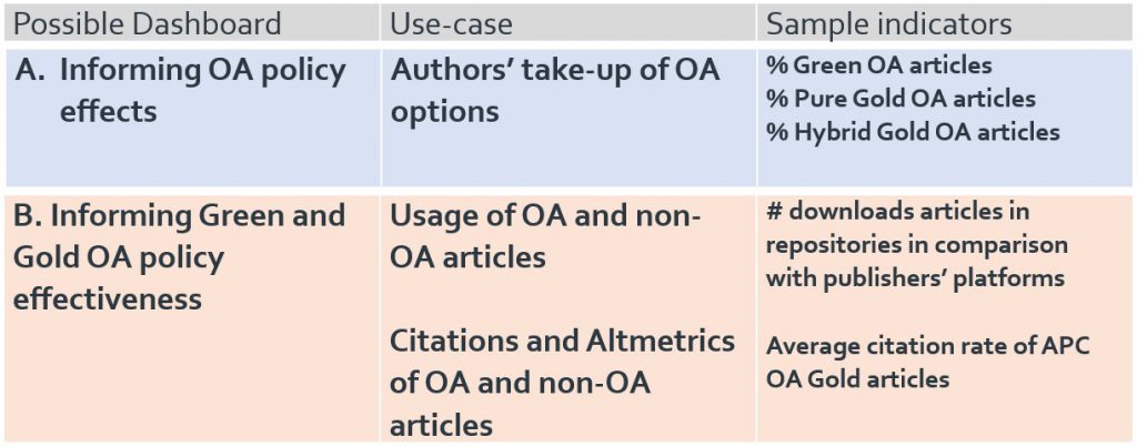
Dashboard A was seen as a possible way to determine if an article is open access or not, and which type of open access it is. This currently requires considerable manual work but is, of course, important for compliance reporting to RCUK and COAF and for REF compliance. Determining which articles are OA underpins other possible dashboards, it would save resources in the various departments supporting OA implementation if this could be automated. Also, participants stated that there is frequent duplication of effort across institutions. They gave the example of identifying the OA status in a subject repository of a certain article with multiple authors across UK universities. This is now done manually at several universities independently of each other. In other words, aggregation will facilitate the identification of OA articles. However, some participants see this also as a minus point for this dashboard—‘it is a lot of work, but we can do it ourselves’—as opposed to the data for Dashboard B, which is more difficult if not impossible for institutions themselves to generate.
A number of participants argued that, while dashboard A would be valuable, they would give a higher priority to dashboard B. The reason is that good and timely data on the effectiveness of OA policies are lacking now and are needed urgently. This is especially true with regard to academics, (‘advocacy about open access has been done to death’), therefore showing a clear citation advantage of OA articles to academics or a clear advantage in terms of Altmetrics indicators for OA articles will change the attitude and compliance of researchers enormously. Dashboard B would not only help libraries, but also help universities and individual departments: ‘It will make the academics see what the benefits of OA are.’ Another participant noted: ‘it will empower us to go to the academics and show hard data.’ Therefore, such a dashboard should be available for the entire university. The participants see a dichotomy: some of the proposed dashboards support libraries in their management of OA, while dashboard B will support multiple audiences such as the academics, research managers etc. It could show the impact of OA publishing on science (more citations) and show the impact on society (number of downloads; Altmetrics). If the costs of OA could be included, one respondent states that this could lead to an assessment of ‘pounds per citation’.
Interestingly, attendees were also keen to take some financial indicators from dashboard C and include them in option A or B.
Conclusions and next steps
Following the workshop and considering the slight preference towards dashboard B showed by attendees, we held further discussions with Jisc, the OA Scotland Group, and library directors. These conversations suggested that dashboard B could be prioritised as a starting point.
The next step in the project will be evaluating the technical feasibility of the dashboard service, which will be led by our associates at Digirati. After their development phase, we will share information on their prototypes and seek further feedback.
Should you have any comments on this project, or if you would like to be kept in the loop, please get in touch with Sarah Fahmy (sarah.fahmy@jisc.ac.uk) or Katie Shamash (katie.shamash@jisc.ac.uk).